 CBR 14 BINGO: Font, because this book is literally about typefaces, which consist of fonts
BINGO: Shadow, Adapt, Funky, Scandal, Font
Before reading this book, I considered myself a bit of a typography geek, because I take pleasure in selecting the most perfect typeface for any situation, and also because I have seen the documentary Helvetica. I realize now, though, that I do not deserve that title, because I clearly do not know enough about typefaces to be able to distinguish Times New Roman from Georgia at a glance, and I haven’t memorized all 200 typefaces in the Zapf family. Sure, I mock Comic Sans as much as the next person, but I also have to admit that once, in a beginning design class, I made liberal use of Rage Italic. I now hide those drafts away and pray they never resurface, like a politician burying his college Halloween costume photos.
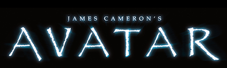
But at least I didn’t use a free font for a $200 million-dollar movie.
My own personal doubts aside, Just My Type is fairly entertaining and informative if you are interested in typography. One of the things I love about type is how expressive it is, and this book promises to explore “. . .what exactly makes a font presidential, or American, or British, French, German, Swiss, or Jewish?” To some extent, Just My Type accomplishes this, but to a larger extent it’s a mixed bag of history and trivia. I learned that Eric Gill, the creator of one of my favorite go-to typefaces, was a sexual deviant (not to go into details, but apparently it included incest and beastiality, not necessarily in that order). Perhaps less scandalous but resulting in a greater loss is the case of Thomas Cobden-Sanderson, creator of a font called Doves, which Cobden-Sanderson promised to bequeath to his former business partner upon his (Cobden-Sanderson’s) death. Unfortunately, Cobden-Sanderson changed his mind. “Fearing its use both in shoddy printing and undesirable subject matter, he took the entire letter fund to Hammersmith Bridge and threw it in the Thames.” Now there’s a typography geek! He’d rather screw over his business partner and risk a lawsuit for his heirs than take a chance on his typeface being used inappropriately.

Case in point
This book does delve more deeply into topics like what makes a font legible vs. readable, why are some fonts more appealing visually than others, and why typefaces go in and out of style. Over-saturation seems to be the answer to the last question–Garfield uses the example of how, at one time, all lowercase letters in a headline would have been blasphemous. Then as more companies started doing it, it became dull (he suggests McDonald’s “i’m lovin’ it” might have pushed this trend over the edge).

Sooooo 2003
I enjoyed this book, though not enough to add it to my reference shelf. My biggest complaint is that there are multiple instances where it describes fine points of difference between two or more fonts (for example, the length of the ascenders or descenders, or the shape of the bowl in the letter “g”), but the publisher failed to include images of those letters for comparison. In a book that provides plenty of real estate for images and font examples, this oversight is baffling. The last chapter is called “Worst Fonts in the World,” which comprises a list of the eight fonts the author hates the most which, while I can sympathize with most of his choices, is pretty subjective.
So if you are a moderate typeface enthusiast (the title to which I’ve downgraded myself) you will enjoy this book well enough. If you are somebody who gets irate when you see an anachronistic typeface in a movie (Helvetica Neue wasn’t introduced until 1983 and this takes place in 1981!), Just My Type probably won’t dive deep enough into the topic for you.
